Developing a concept might be the most difficult thing ever…EV-ER. At the same time, it is necessary, because it provides a filter through which all other decisions regarding the design are made. Here’s a first take on the concept for my gallery.
Immersion fosters understanding, by exposing the community to its diversity. Bridging the gap between generations, the gallery celebrates cultures and empowers others through fair trade and sustainability; inspiring a limitless ripple effect. Refreshed by shared experiences and an appreciation of distinction, new life is restored to what was once desolate.
Moving from the concept development phase to logo design requires consideration of how you represent your concept in an illustration and/or font. When you think about it, a logo is really a shortcut to your brand. Ideally, someone looks at your logo and knows who you are and what you are about. Below are three simplified logos that I have in mind for the gallery.
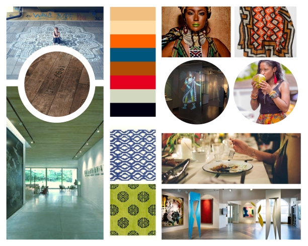
After some feedback regarding my initial moodboard for the art gallery, I have focused further on the integration of technology, gallery layout & lighting, combined with the community and cultural aesthetics. Everyday, I learn that there is always more to learn…
A mood board for an art gallery in the West Side area of Buffalo, NY. The bold contrast within the space celebrates the community coming together in a shared environment, despite varied backgrounds.
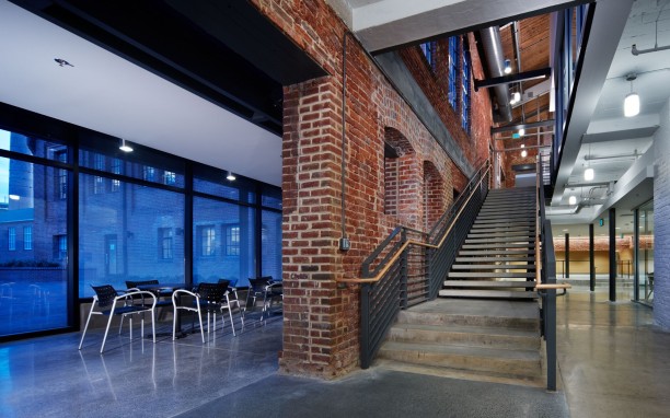
Adaptive reuse can be simply understood as giving a new purpose to an old building. In many cities, structures originally home to manufacturing plants and small storefronts were abandoned as people moved out of town in search of both jobs and suburban living. Re-purposing these original structures has caused a resurgence in urban living. Old mills have become retail and event space, industrial styled lofts or condos and small storefronts have become chic art galleries and boutique restaurants. Sustainability and a desire to limit an individual’s economic footprint are a few factors driving the movement toward adaptive reuse. Altering the function of an underutilized space, rather than demolishing it allows us a glimpse into the history of a place and an appreciation for the past.
It is important to clarify that adaptive reuse and historical preservation are different things, although closely related. Historic preservation with regard to the built environment seeks to uphold or recreate the original space and for its originally intended purpose. While this is important to our history as a whole, it can be an expensive endeavor given the regulation and specific nature of locating resources and materials from the past. Adaptive reuse is not necessarily cheap, but it is both good for the environment and offers a return on investment for building owners or stakeholders, as the building has been given a new purpose.
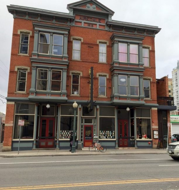
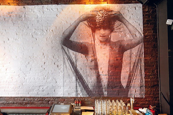
Denver’s historic Airedale building, once home to a brothel, peep shows and an adult book store, now houses chef Justin Cucci’s restaurant and music venue, Ophelia’s Electric Soapbox. Cucci used the building’s colorful history as the springboard for the concept. (Photo: Adam Larkey)
Featured here are a few examples of spaces that have been reclaimed around the United States. From a former brothel turned restaurant & music venue in Denver, Colorado to a mixed-use facility in Asheville, NC and an engineering shop building on the campus of NC State that is now combined classrooms and research space. Adaptive reuse projects breathe new life into old, vacant buildings, but they’re not for the faint of heart.
Ophelia’s Electric Soapbox – Denver, CO
Chef Justin Cucci didn’t really have the time or money to do another restaurant. He already had two successful spots operating at full speed. But when a local designer purchased the historic building and approached Chef Cucci with the opportunity to help bring the abandoned, Victorian-era structure back to life, the offer was too tempting to pass up, and Ophelia’s Electric Soapbox emerged.
Ophelia’s was once a brothel. (Photo: Oliver Nasralah)
Although the building was in a state of decay, Cucci, whose first two restaurants reside in a former gas station, saw a chance to marry creative concept development with adaptive reuse in a way that would honor the building’s past. The fact that its past included a brothel, a peep-show venue and, most recently, a video store just added to the appeal. Working with architecture and design firm BASS Architecture, he created an eclectic, boudoir-inspired concept that boldly celebrates the building’s past lives.
Original brick walls were retained, where possible, including one in the main dining room that now carries an image of Ophelia, the concept’s namesake and muse. (Photo: Adam Larkey)
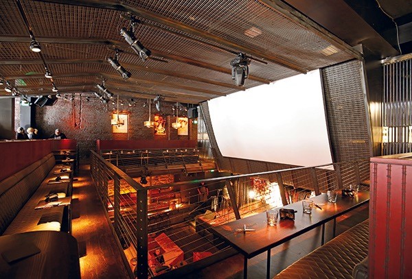
Opened in April as a 225-seat “gastro-brothel” and live music venue on the main and lower levels of the three-story building, Chef Cucci illustrates the extreme highs and lows of adaptive reuse projects. Lengthy, costly, exhilarating at times and exasperating at others, it’s an example of adaptive reuse at its best, ultimately sustaining and preserving buildings that still have good bones while reinventing and reinvigorating them for new use.
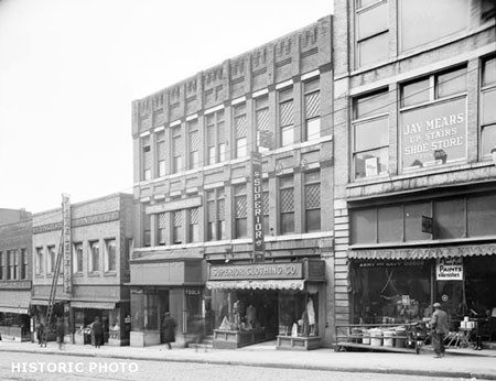
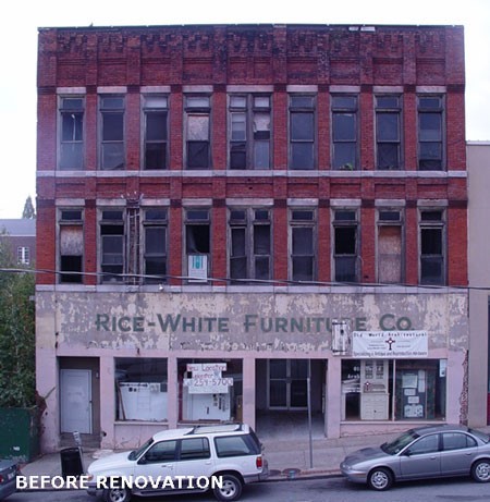
Rice-White Building – Asheville, NC
From 2006 to 2014, Rowhouse Architects and Heartwood Renovations, along with public interest groups undertook renovation of the historic Rice White Building, located in the heart of downtown Asheville. Originally built in the 1890’s by the Hilliard family, the building initially served as a mixed-use structure. The ground floor accommodated two retail spaces, and a medical practice operated by two generations of the Hilliard family. The second floor was home to an undertaker’s business, while the third floor served as a meeting space for two fraternal lodges. In the 1910’s the second floor was converted to the central labor union offices and the socialist reading room. Both the second and third floors were converted into a small downtown hotel in the 1930’s.
Another transition came in the 1950’s when a single furniture business, Rice-White Furniture took over the building, giving it the name it is now known for. The main floor housed a retail showroom, while additional items were warehoused on the second and third floors. Despite a large fire, much of the building’s initial character and woodwork survived despite a fire that ruined sections of the upper floors.
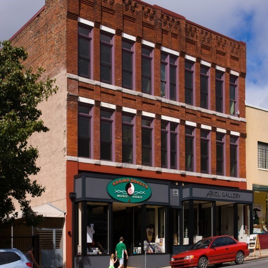
Renovated Rice-White Building – Asheville, NC (Photo: Warner Photography)
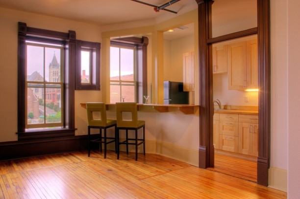
The 2014 renovation returned the building to a mixed-use facility once again. An independent jewelery store and an art gallery facing Biltmore Avenue make up the first floor, along with smaller combined commercial and residential spaces in the rear. The upper floors of the building are now made up of eight residential units showcasing much of the building’s original architecture and views of downtown Asheville.
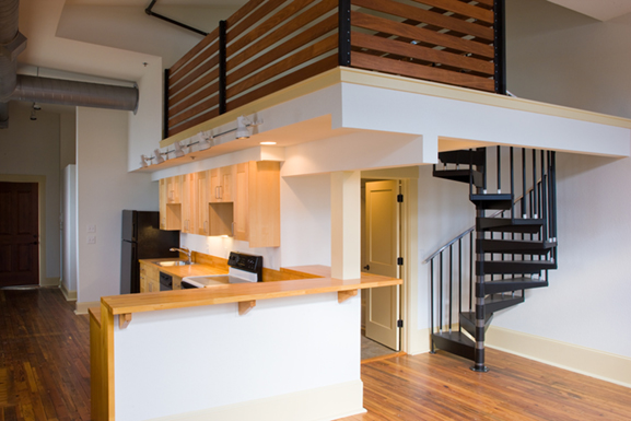
Two-story residential unit (Photo: Warner Photography)Residential kitchen (Photo: Warner Photography)Residential interior with Asheville city views (Photo: Warner Photography)
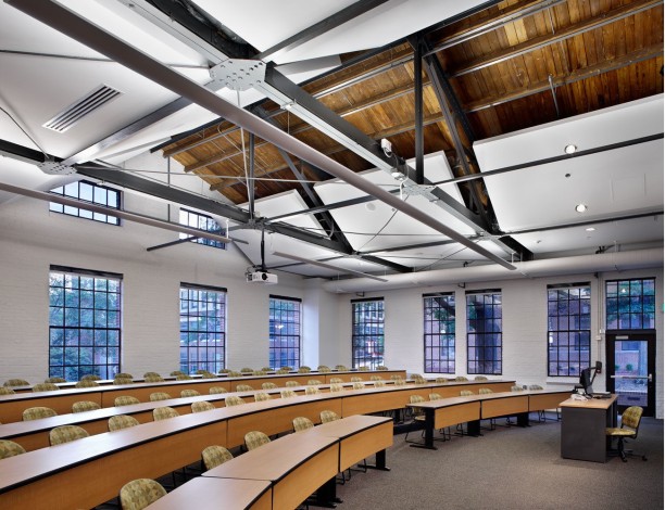
Park Shops Building – NCSU – Raleigh, NC
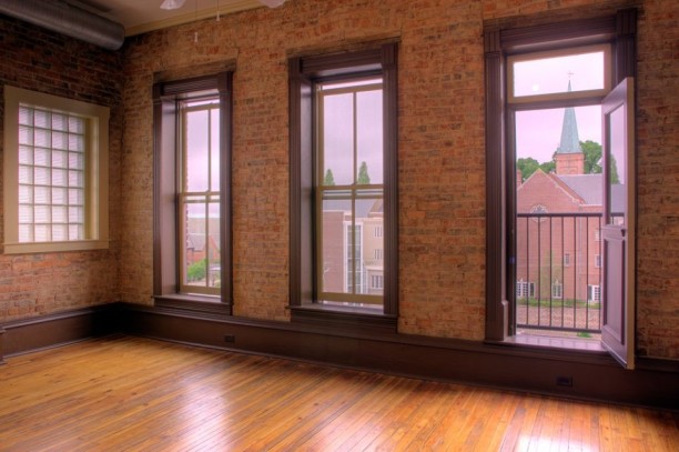
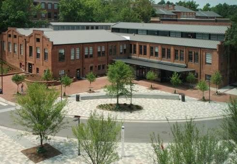
The Park Shops Building initially served as the shop for NC State’s Mechanical Engineering Department. Built in 1914, the renovation of some 48,000 existing square feet, is proof of the University’s commitment to sustainability and the pride they have in their campus’ history. The architecture and engineering firm of Clark Nexen were tested by having to reimagine a space that initially served one department, into a space that must serve multiple functions.
Park Shops Building – NC State University Campus – Raleigh, NC (Photo: JWest Productions)
Within the renovated Parks Shops Building, you’ll find classrooms, research and teaching labs for two departments, along with video-conferencing and televised classrooms, as well as a café and offices for student services and advising. In addition to renovating the existing square footage, a 3,000 square foot glass plaza creates a modern entry area and space for public gathering.
Classroom – Check out all of that daylight!!! (Photo: JWest Productions)
The design firm embraced the original brick exterior and industrial feel of the building, while incorporating modern technology and engineering. In doing so, they improved the acoustics and provided for the functionality required in contemporary learning environments, without losing the character of the building. Locating classrooms where they allow in maximum daylight allows for lower energy costs. The renovation completed in 2009 has won multiple awards for architecture and design, and it’s not hard to see why.
Glass Plaza addition with gathering space(Photo: JWest Productions)
Last week was busy as I spent one afternoon at Vivid Interiors and another touring Weatherspoon Art Gallery on the campus of UNC Greensboro. Ironically enough, I graduated from UNCG in December 2005, and not once in the four years I spent going to school there did I walk through Weatherspoon. After my visit last week, I’m wishing I’d checked it out sooner, especially since I spent so much time on campus! The purpose for visiting last week was to garner inspiration for the Bienenstock Furniture Library Design Competition this fall.
Weatherspoon Art Gallery – UNC Greensboro Campus – Greensboro, NC
Upon entry to the gallery, you find yourself in a rounded atrium as shown above. The daylight streams down from above to offer light into the center of the building, while you may or may not notice the plaster frieze carved into the walls encircling your head. I was struck at having not noticed the carvings until the curator pointed it out to me. The blend of art and wall was so seamless, it almost went unnoticed! Further, as your eye moves up you see the windows of the second floor galleries, which also benefit from the daylight coming in.
Weatherspoon Gallery Lobby – Note the plaster frieze located below the second-floor windows.
After getting over the awesome plasterwork in the lobby, I wandered down the hall where I checked out this piece. While the object of the trip was not necessarily to focus on the art itself, how could I help but check this out?! The piece was created from wood, burlap and resin, titled “DYBY” by artist Magdalena Abakanowicz. I think that I most appreciated the location the gallery chose for this interesting work. Just imagine walking by on the sidewalk outside the window…I know I would have to go in and check out. Which actually makes it inspiration after all, since a goal for design of any “human experience” space is to get people in the door.
“DYBY” (1993) – Magdalena Abakanowicz – wood, burlap & resinFinding my way to the second floor of the gallery, I was taking note of all the interior details from wall placement to lighting and even where seating was offered. Down the long corrider leading to exhibition galleries, was a painting with a linear light fixture hanging parallel to the work and the long window allowing daylight to stream in overhead. I was inspired by the rhythm created by the similar linear elements and imagined what it would be like to view the painting at night, given the contrast that would likely be present in the darkness overhead.
In continuing through the gallery considering what might inspire the gallery I’ll be designing for Bienenstock, I found an interesting sculptural exhibit placed in front of a curved half-wall. While I took in the curve, I immediately noticed there was space around back and I had to know what might be back there. It felt a bit like a great surprise might be waiting on the other side. Not to be disappointed a different sculpture from the same series was there. Using a wall to separate the pieces allows you to consider them individually and maintains a clean look within the gallery and freedom from distraction.
This curving half-wall is what I decided would inspire some areas of my gallery. I appreciate simplicity and clean line very much in design and feel like it would be advantageous in a gallery exhibiting multiple types of art, as well as allowing the gallery to showcase many works without it feeling cluttered. Below is my concept sketch for doing a few “S” curve walls throughout the art gallery I’m designing. This should allow for sculpture, or even some multimedia works to be exhibited within the curve. I also think that many folks will, like me, wonder…”what’s on the other side.”
Being a design student has some great perks, one of which is getting to meet with some amazing members of the interior design industry. Last week, along with my classmates I got to visit Vivid Interiors, a design firm in downtown Greensboro, NC. Gina Hicks is an alum of Randolph Community College’s Interior Design program and she partners with Laura Mensch to run Vivid Interiors. Listening to Gina discuss her love for design and her passion for running her business was inspiring. She provided us a lot of insider knowledge regarding how to set up and pursue small business ownership, along with building client relationships.
Photo: Katie – Twinstripe.com
Their business is made up of design services for both residential and commercial clients, showroom design for furniture manufacturers and retail. Products in their store include custom upholstery made in North Carolina, along with local art and other home decor items. The space is eclectic and vibrant, and I could have spent all day hanging out there. I’m looking forward to dropping by on occasion to see what fun designs they come up with next!
Our Class, Instructors Holly & Addie, along with Vivid Owners Gina & Laura
My residential design course over the summer allowed me the opportunity to design for the Woodwards. Holly and Mark live in High Point, NC with their sweet dogs Dash & Lillie. After ten years in their 1930’s bungalow home, they’ve decided to stay forever. In order to allow them to live and work in their home for as long as possible, I was asked to provide ideas for modifying their home so it would be accessible, as they age in place. The couple also requested the home be expanded to include a master en suite bath, an additional bedroom, main floor laundry and a garage. Adding to the challenge, I was asked to apply a Bohemian aesthetic to their home, while including a few select furnishings and works of art that are sentimental.
Woodward Residence – High Point, NC
My overall concept for the space was to keep the color palette fairly neutral, using textures and layers to provide depth and comfort. Holly and Mark are fun people who enjoy entertaining in their home, so I chose to use turquoise blues and rust hues as accents. Finally, mixing and matching vintage and new furnishings instills a casual and collected vibe that fits the Bohemian approach.
In order to open the space for easy movement throughout the home, I took down the cased opening between the living and dining area and most of the wall between the kitchen and dining. The dining banquette is tucked into built-in bookshelves on a deep turquoise blue accent wall. My goal was to provide a dining area that felt a bit more intimate in the midst of the open floor plan.
The kitchen is my favorite spot in the redesign of this house. The butcher block kitchen island is the workhorse in the space, with an extra prep sink and a pull-out countertop on the side. Making sure there are work surfaces at different heights allows the couple to transition in their home. Also, I added a dog crate in the island for Lilly who needs a safe spot of her own when Holly and Mark aren’t home with her. The draperies hung from rods secured to the ceiling offer another textural element and help to soften all the hard lines that exist in a kitchen.
Getting to work on the Woodward residence was a great experience. Learning to balance what a client wants in terms of style and blending that with functionality for aging in place was a challenge. My hope is that I provided some options that will allow them to enjoy their home with their four-legged kids for as long as possible.
During the summer, I completed both a design for the nurses’ station of a women’s health office, along with a logo. This was part 1 of a 2-part project, that would conclude with designing the waiting room for the office. Overall, the goal was to achieve a design that utilized sustainable finishes that were also anti-microbial, while at the same time keeping an organic and soothing feel. Most of us have gone to the doctor, and can, therefore, relate to the feelings of anxiety that occasionally go along with it. So, my overall design plan was to evoke a feeling of peace and keep the space simple, to avoid over-stimulation. I chose a color palette inspired by Wink Gaines’ photo, “Sandhill Crane” (www.winkgainesphoto.com). The warm whites and soft browns combined with cool blue felt comfortable, like the colors you’d find on a private beach.
Logo DesignNurses’ Station
Designing the waiting room for this facility was part 2 of the project, which I completed at the beginning of fall semester. The color palette was already set, so the tough part was space planning to allow seating for sixteen, while including a reception area as well. Having done some research on new ideas in waiting rooms, I wanted to include space for active waiting, as well as passive waiting. Those preferring to wait actively need something physical to do while waiting, as opposed to those who passively wait reading a magazine or looking at their phones. My design for the waiting room includes two desk stations for working on a tablet or laptop, as well as custom sand tables that allow for moving magnetic “sand” that is encapsulated in a glass tabletop, using a magnetic pen on the outside of the glass.
In addition, I wanted to incorporate some type of flowing water element, in order to calm those who might be restless awaiting their visit with the doctor. In order to maintain the color palette, and create a focal point within the space, I chose to do a custom water veil feature against a curved copper wall that had some patina on it. This balances out the vibrant copper by bringing in more soothing green-blues within the space. The waiting room is a bit more forgiving in terms of materials, so I used a combination of hard flooring, with wall to wall, low-pile carpeting to provide some softness underfoot. I wanted to also make the ceiling more interesting, so I chose to drop the ceiling throughout the waiting space using swirls and curves in the sheetrock overhead. The inclusion of cove lighting highlights the curves, while a large drum shade centered in the space provides some diffused lighting throughout.
Waiting Room
Throughout the space planning phase for the waiting room, I considered different preferences in waiting and comfort. Knowing the space must accommodate a variety of patients in differing treatment situations, I created zones that would allow patients to wait in an area most comfortable for them. There are a variety of seating options from sofas, benches and individual chairs, along with two small work stations for those that may need to work while waiting (not pictured above). The furnishings are arranged in a conversational way that is likely more relaxing for extroverted personalities. Shown below is a floor plan of the facility that gives a better representation of the space plan.
Floor Plan – note the layout of waiting area is arranged to promote conversation
Looking at the waiting area and considering introverted versus extroverted personalities (see my last post on Designing for Multiple Personalities), I think the furniture layout is relatively balanced, but it leans toward being more comfortable for an extrovert. In order to allow a few more options for the introvert, I updated the space plan by removing the sofa from the corner and adding two additional chairs with a table in between to allow for division. This allows an introverted personality to sit without someone at their back, and to be separated from others as much as possible within the space.
Revised Floorplan – more introvert-friendly
Overall, this project was a challenge. Being asked to consider the variety of factors, from individual patients and their stories, to balancing personality types, along with the inclusion of features and finishes that are required in a healthcare environment. There were a great number of variables involved and I am pleased with how my design turned out. I’ve learned that having a strong concept and design program in the early stages is the key to a cohesive design that solves the design challenges presented.

![20170907_135353[1]](https://joyrichdesign.files.wordpress.com/2017/09/20170907_1353531.jpg?w=612)
![20170907_135232[1]](https://joyrichdesign.files.wordpress.com/2017/09/20170907_1352321.jpg?w=612)
![20170907_135849[1]](https://joyrichdesign.files.wordpress.com/2017/09/20170907_1358491.jpg?w=612)
![20170907_140101[1]](https://joyrichdesign.files.wordpress.com/2017/09/20170907_1401011-e1505353004113.jpg?w=612)


