It has taken several weeks and soooo many hours to complete this project. At the end, I am happy with how it all came together. The overall design feels cohesive and there are plenty of moments throughout this gallery that I think bring the space to life. Working to incorporate the required spacing for the different areas, while keeping in mind code and developing the creative spirit within the gallery was difficult. The gallery is intended to provide a space where the community can come together, fellowship and appreciate that our differences are not often as great as we may believe.
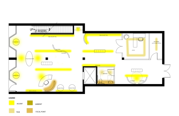
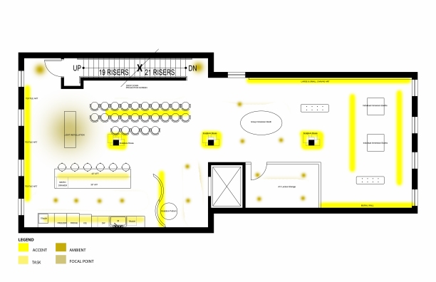
Any gallery space needs drama to envelope visitors and keep them coming back. A proper lighting plan is important to the overall design of the space. A first draft of my lighting plan makes use of track spots for highlighting the artwork. Some individual pendants will accent the kitchen area on the second story, while a light installation provides a conversation piece.
Moving through the process of designing the gallery, I’ve been challenged to think of what might make people want to visit. Then, once they get there, how will the design carry them throughout the space? Does the space allow everyone the same opportunity to experience the works in the same way? So, there has been much to think about.
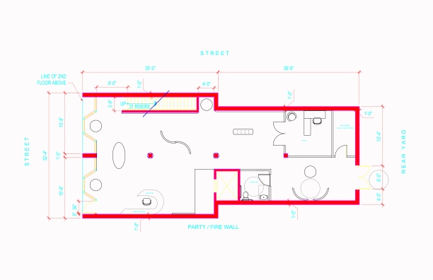
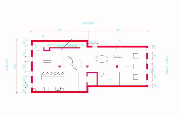
Here are my plans for the first and second story gallery spaces. I found an idea for individual isolation booths, as well as larger group booths that allow for a variety of experiences. My thought is that people would enter the booths and the closing of a door, or their presence within the space would start a projection or video experience. This would ensure sustainability as energy is not being used when someone is not in the booth. In addition, there is room for floor to ceiling columns which would have niches to display sculpture, in them. Finally, I’ve alotted wall space for canvas or textiles as well.
After working through some of the space plan and choosing some furnishings for the gallery space, I’ve revised one logo to what might be the final product. Adding a tribal textile print to the blue “immersed” section of the logo, along with brightening the orange to give it more energy, I think this one works. The project overall is progressing and I look forward to letting you see it soon!
![]()
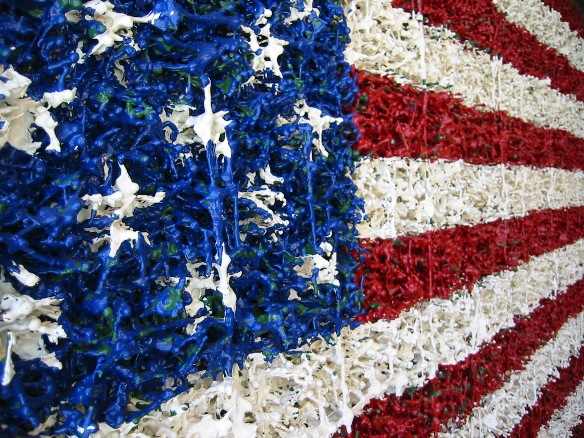
Just last week, we had the opportunity to visit 21c in Durham, NC. It is an art gallery, with work displayed in the restaurant as well, along with a hotel. The gallery space had several different types of media, including a virtual reality booth, a flip book that continually rotates the pages, and a video booth with a large projection screen. Another interesting piece, was an American flag sculpture created by green army men, that were then painted.
The point of our visit was to take note of the different media used to create art, while at the same time visualizing different methods of display for the multiple media that exist in the art world today. All of this is to push our thinking in the design and layout of our art gallery for the Bienenstock competition. In addition to the works throughout the gallery, the Counting House restaurant also contains different works, which really brings some visual interest and conversation starters to the dining area.
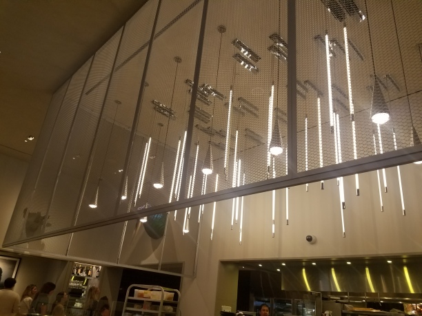
My favorite feature in the Counting House was the light installation in a cage above the kitchen prep area. Truly a great example of both form and function. It serves a purpose for the kitchen area, but also provides an interesting view of light. Another feature I appreciated in the Counting House bar area was the mirror TVs located in the cabinet fronts of shelving. While a TV is not necessarily a lovely design element, it does serve a purpose and most patrons likely expect there to be one in a bar. So, given that it meets a need for patrons, I appreciate the designed element of using the mirror to hide the TV when not in use.


Along a similar line was, likely the highlight of our trip…the smartglass bathrooms. You walk down the hall on the mezzanine level and find individual stalls with toilet & sink visible through glass doors and windows. It is slightly unnerving at first, however once you step into a stall, close the door and then lock it, the smartglass changes from clear to opaque so you have your privacy! Never have I been so intrigued by a restroom before!
In the midst of all the design work for both our residential class, design competition and the commercial design competition, we’ve had a few enlightening field trips lately. We had the opportunity to tour the facility and learn about leather from Tiger Leather co-founder and president, Frank Toledano. First things first, why Tiger Leather? A tiger was Frank’s high school mascot, simple answer, no fuss…kind of like leather, huh? We were privileged to check out their Greensboro, NC operation which houses design staff, marketing, and logistics, along with their massive warehouse. Imagine the smell of clean leather filling the air as you move through row after row, filled with hides ready for manufacturers to turn into the many leather goods we use daily.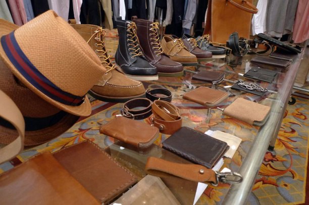
Think about your daily encounters with or the items you are wearing made of leather. Most people have at least 3 – 4 leather items on them each day…watch strap, purse or wallet, jacket or shoes, and belt. Then, think about your cozy armchair at home or the waiting room where you sat for a bit, even your car’s upholstery…all leather. One of the reasons leather is used so widely, is because of its strength and durability. Especially when it comes to hospitality furnishings and automobiles.
We were offered a chance to see how a few of Tiger’s hospitality leathers would respond to coffee spills and ballpoint pen, and they more than met the challenge. One of the major topics of discussion was their desire to educate designers regarding leather’s functional qualities so that designers can then specify a product that will meet consumer expectation. A great many negative experiences with leather in the furnishings industry specifically come from the specification of leathers that were not intended to perform in the manner a customer expected. Education ensures that clients know and understand what they are getting so that it performs in the manner they require for home or hospitality.
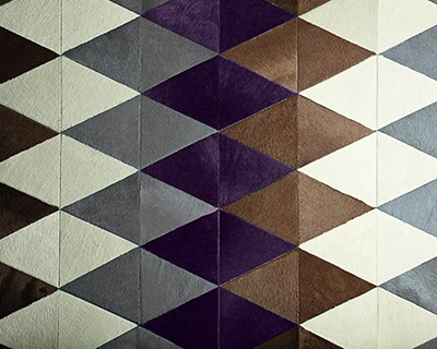
Another highlight of the trip was meeting Elliot and learning what he does in designing some of the rugs and trade show booths for Tiger Leather. The company focuses on fashion trends for a great deal of their design inspiration, and he developed their most recent booth to resemble a high-end beauty counter concept. We saw a video he created using sketchup and podium renderings, in order to pitch the idea to Frank, and it was incredible! In addition to designing their booth, he showed us several concepts he created for using the company’s logo in a pattern for a few of hair on hide rugs. The final design for one of the rugs resembled a greek key, so the pattern while subtle was definitely a nod to the brand. Overall, the experience of learning about leather was well worth the trip.
Developing a concept might be the most difficult thing ever…EV-ER. At the same time, it is necessary, because it provides a filter through which all other decisions regarding the design are made. Here’s a first take on the concept for my gallery.
Immersion fosters understanding, by exposing the community to its diversity. Bridging the gap between generations, the gallery celebrates cultures and empowers others through fair trade and sustainability; inspiring a limitless ripple effect. Refreshed by shared experiences and an appreciation of distinction, new life is restored to what was once desolate.
Moving from the concept development phase to logo design requires consideration of how you represent your concept in an illustration and/or font. When you think about it, a logo is really a shortcut to your brand. Ideally, someone looks at your logo and knows who you are and what you are about. Below are three simplified logos that I have in mind for the gallery.
Stay tuned to see how these designs progress!
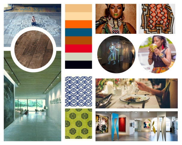
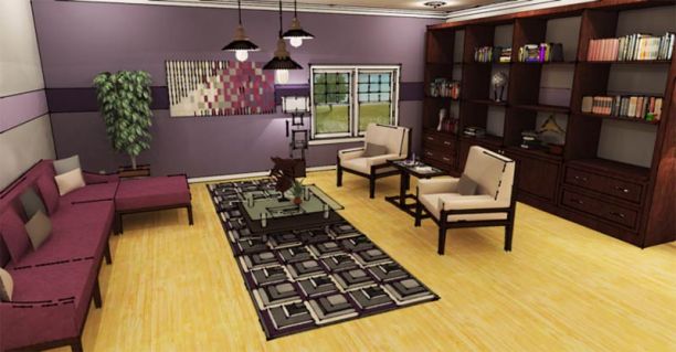
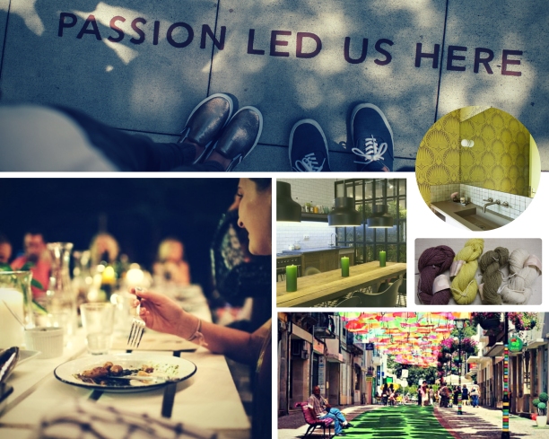
After some feedback regarding my initial moodboard for the art gallery, I have focused further on the integration of technology, gallery layout & lighting, combined with the community and cultural aesthetics. Everyday, I learn that there is always more to learn…
A mood board for an art gallery in the West Side area of Buffalo, NY. The bold contrast within the space celebrates the community coming together in a shared environment, despite varied backgrounds.
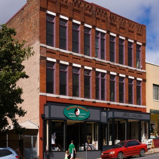
Adaptive reuse can be simply understood as giving a new purpose to an old building. In many cities, structures originally home to manufacturing plants and small storefronts were abandoned as people moved out of town in search of both jobs and suburban living. Re-purposing these original structures has caused a resurgence in urban living. Old mills have become retail and event space, industrial styled lofts or condos and small storefronts have become chic art galleries and boutique restaurants. Sustainability and a desire to limit an individual’s economic footprint are a few factors driving the movement toward adaptive reuse. Altering the function of an underutilized space, rather than demolishing it allows us a glimpse into the history of a place and an appreciation for the past.
It is important to clarify that adaptive reuse and historical preservation are different things, although closely related. Historic preservation with regard to the built environment seeks to uphold or recreate the original space and for its originally intended purpose. While this is important to our history as a whole, it can be an expensive endeavor given the regulation and specific nature of locating resources and materials from the past. Adaptive reuse is not necessarily cheap, but it is both good for the environment and offers a return on investment for building owners or stakeholders, as the building has been given a new purpose.
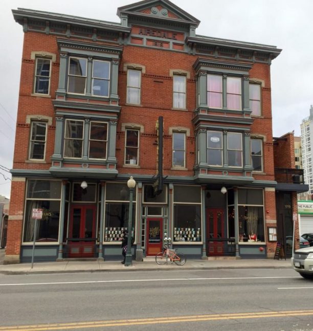
Featured here are a few examples of spaces that have been reclaimed around the United States. From a former brothel turned restaurant & music venue in Denver, Colorado to a mixed-use facility in Asheville, NC and an engineering shop building on the campus of NC State that is now combined classrooms and research space. Adaptive reuse projects breathe new life into old, vacant buildings, but they’re not for the faint of heart.
Ophelia’s Electric Soapbox – Denver, CO
Chef Justin Cucci didn’t really have the time or money to do another restaurant. He already had two successful spots operating at full speed. But when a local designer purchased the historic building and approached Chef Cucci with the opportunity to help bring the abandoned, Victorian-era structure back to life, the offer was too tempting to pass up, and Ophelia’s Electric Soapbox emerged.
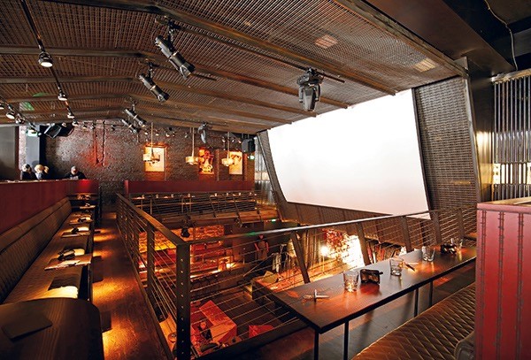
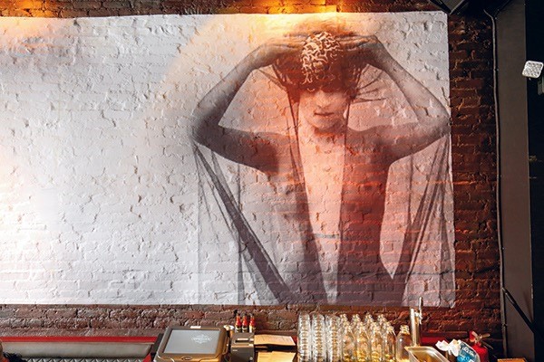
Although the building was in a state of decay, Cucci, whose first two restaurants reside in a former gas station, saw a chance to marry creative concept development with adaptive reuse in a way that would honor the building’s past. The fact that its past included a brothel, a peep-show venue and, most recently, a video store just added to the appeal. Working with architecture and design firm BASS Architecture, he created an eclectic, boudoir-inspired concept that boldly celebrates the building’s past lives.
Opened in April as a 225-seat “gastro-brothel” and live music venue on the main and lower levels of the three-story building, Chef Cucci illustrates the extreme highs and lows of adaptive reuse projects. Lengthy, costly, exhilarating at times and exasperating at others, it’s an example of adaptive reuse at its best, ultimately sustaining and preserving buildings that still have good bones while reinventing and reinvigorating them for new use.
Rice-White Building – Asheville, NC
From 2006 to 2014, Rowhouse Architects and Heartwood Renovations, along with public interest groups undertook renovation of the historic Rice White Building, located in the heart of downtown Asheville. Originally built in the 1890’s by the Hilliard family, the building initially served as a mixed-use structure. The ground floor accommodated two retail spaces, and a medical practice operated by two generations of the Hilliard family. The second floor was home to an undertaker’s business, while the third floor served as a meeting space for two fraternal lodges. In the 1910’s the second floor was converted to the central labor union offices and the socialist reading room. Both the second and third floors were converted into a small downtown hotel in the 1930’s.
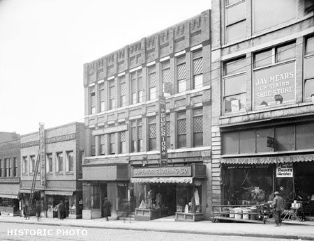
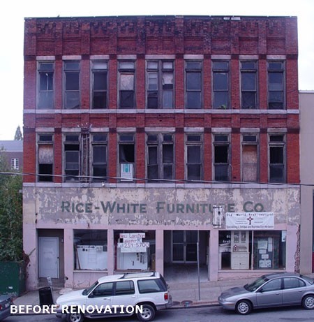
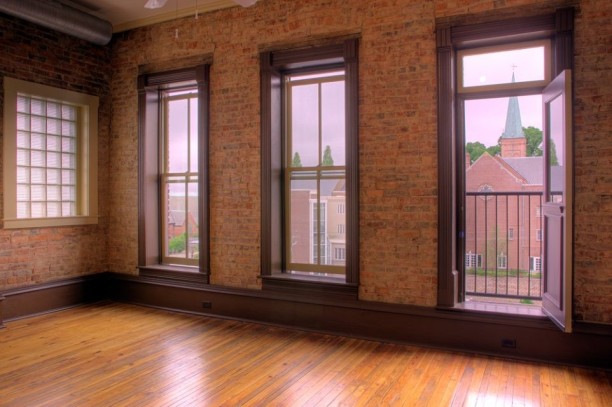
Another transition came in the 1950’s when a single furniture business, Rice-White Furniture took over the building, giving it the name it is now known for. The main floor housed a retail showroom, while additional items were warehoused on the second and third floors. Despite a large fire, much of the building’s initial character and woodwork survived despite a fire that ruined sections of the upper floors.
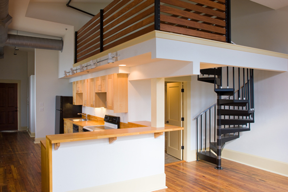
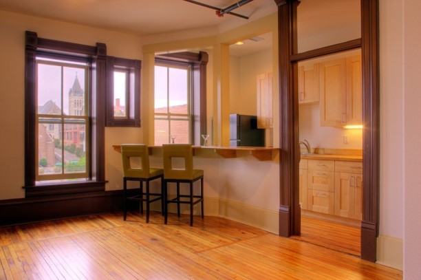
The 2014 renovation returned the building to a mixed-use facility once again. An independent jewelery store and an art gallery facing Biltmore Avenue make up the first floor, along with smaller combined commercial and residential spaces in the rear. The upper floors of the building are now made up of eight residential units showcasing much of the building’s original architecture and views of downtown Asheville.
Park Shops Building – NCSU – Raleigh, NC
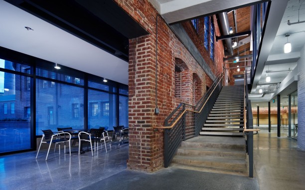
The Park Shops Building initially served as the shop for NC State’s Mechanical Engineering Department. Built in 1914, the renovation of some 48,000 existing square feet, is proof of the University’s commitment to sustainability and the pride they have in their campus’ history. The architecture and engineering firm of Clark Nexen were tested by having to reimagine a space that initially served one department, into a space that must serve multiple functions.
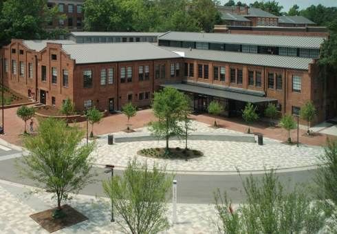
Within the renovated Parks Shops Building, you’ll find classrooms, research and teaching labs for two departments, along with video-conferencing and televised classrooms, as well as a café and offices for student services and advising. In addition to renovating the existing square footage, a 3,000 square foot glass plaza creates a modern entry area and space for public gathering.
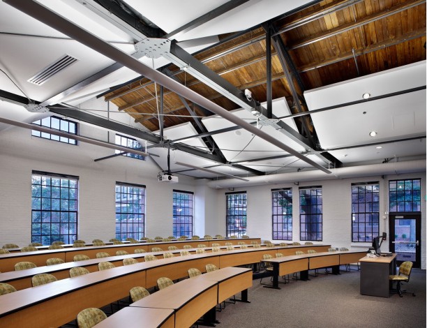
The design firm embraced the original brick exterior and industrial feel of the building, while incorporating modern technology and engineering. In doing so, they improved the acoustics and provided for the functionality required in contemporary learning environments, without losing the character of the building. Locating classrooms where they allow in maximum daylight allows for lower energy costs. The renovation completed in 2009 has won multiple awards for architecture and design, and it’s not hard to see why.
Sources:
Kurul, E. (2007). A qualitative approach to exploring adaptive re-use processes. Facilities, 25(13), 554-570. doi:http://dx.doi.org/10.1108/02632770710822634
Dyson, K., Matthews, J., & Love, P. E. D. (2016). Critical success factors of adapting heritage buildings: An exploratory study. Built Environment Project and Asset Management, 6(1), 44-57. Retrieved from http://proxy144.nclive.org/login?url=https://search.proquest.com/docview/1761040927?accountid=13429
http://learn.org/articles/Jobs_in_Historic_Preservation_Career_and_Salary_FAQs.html
https://www.nps.gov/subjects/historicpreservation/what-is-historic-preservation.htm
https://charlestonfoodbloggers.com/2015/04/06/best-restaurant-in-each-north-carolina-county-2015/
http://urbanasheville.com/buildings/rice-white/
http://www.rowhouse-architects.com/projects/ricewhite.html
https://www.clarknexsen.com/project/park-shops-adaptive-reuse/
https://historicalstate.lib.ncsu.edu/timelines/campus-buildings-grounds#d1910
